SERVICES:
Visual Identity & Packaging
DATE:
2012
SECTOR:
Commercial Consumerism
BRIEF
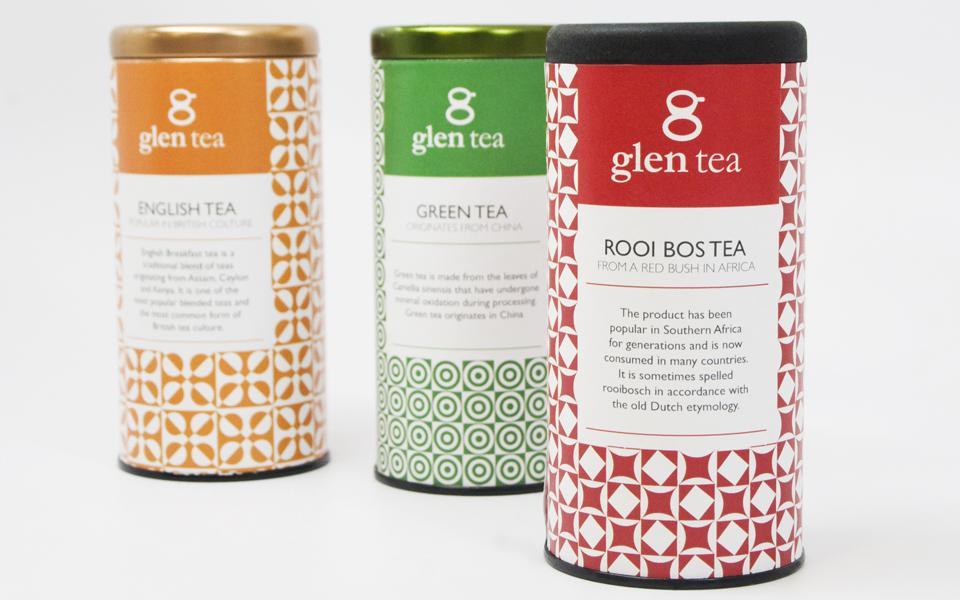
Glen’s teas’ growing popularity is due to what the brand stands for – bringing people together. Sharing each others’ company, conversation, laughter, and of course, a strong, fresh cup of Glen Tea. Many things change in our world these days. However, the joy we get from sharing a cup of Glen Tea with our family and friends remains unchanged. With the ever-changing times, the brand also needed a refresh. Below I redesigned their logo and packaging for a “fresher” look.
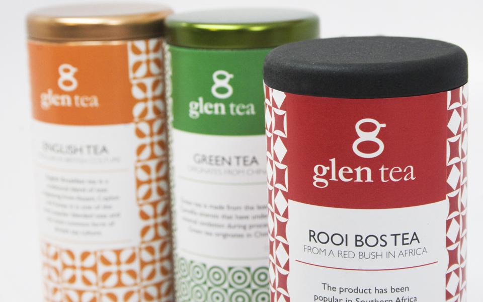
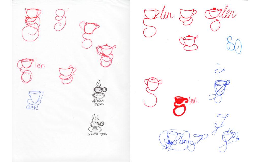
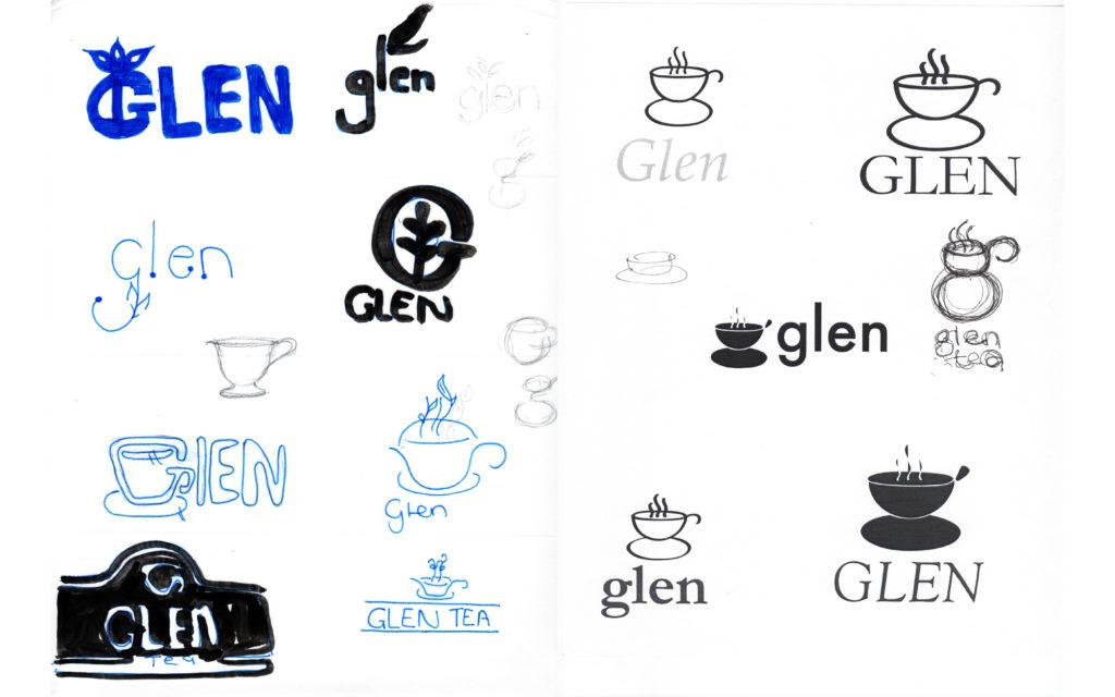
The logo mark is inspired by the “g” of the product name “glen tea”. I manipulated the original letter shape into the form of a teacup. This new shape can either be read as a “g” or as an image representation of a teacup.
The packaging is modern and fresh. The colour of the logo and packaging will differ depending on the type of tea in the package. For example, if its green tea the packaging and logo colour will be green.


Get In Touch
Liked what you saw and are curious to learn more, get in touch below.
